First Things First
/ about
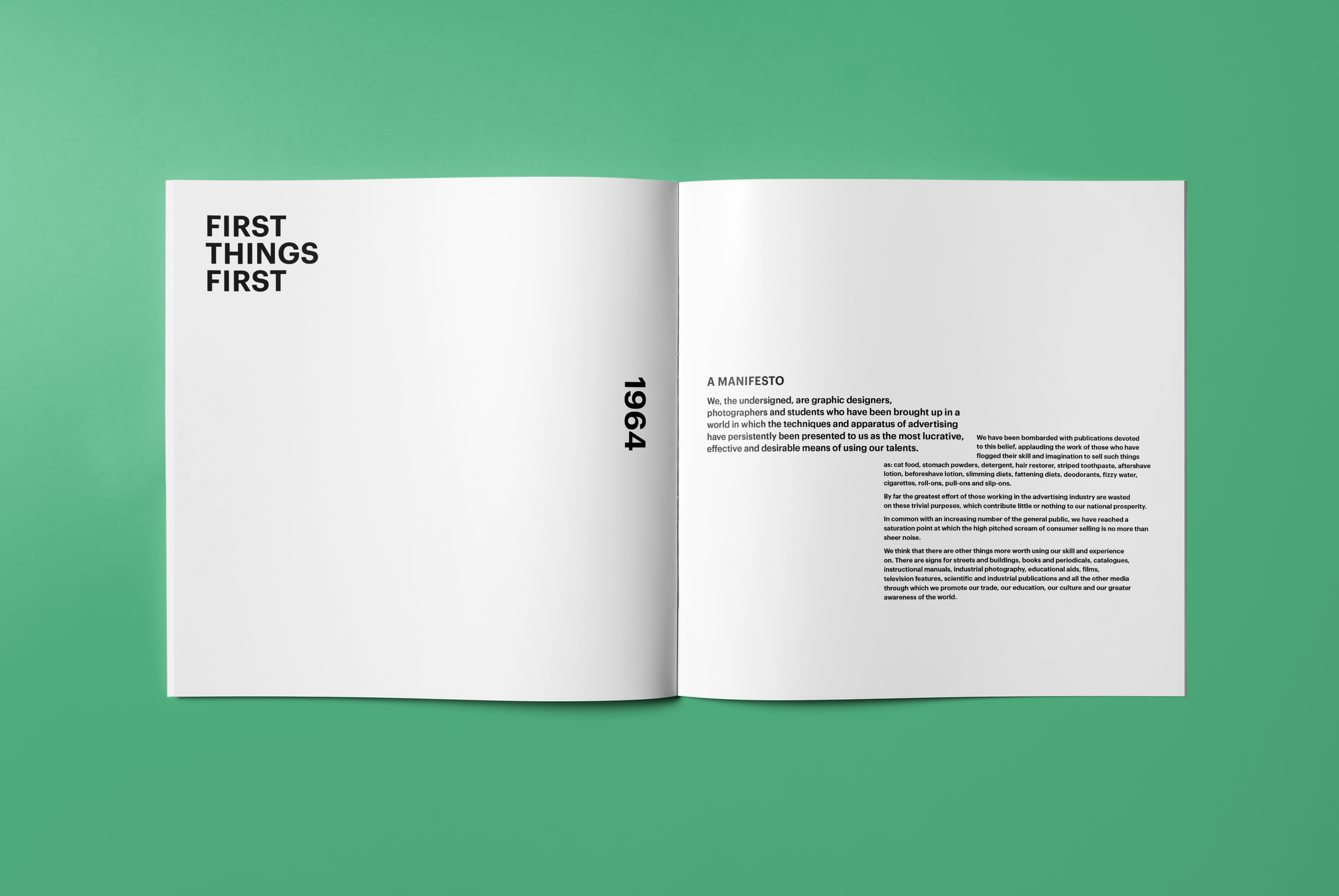
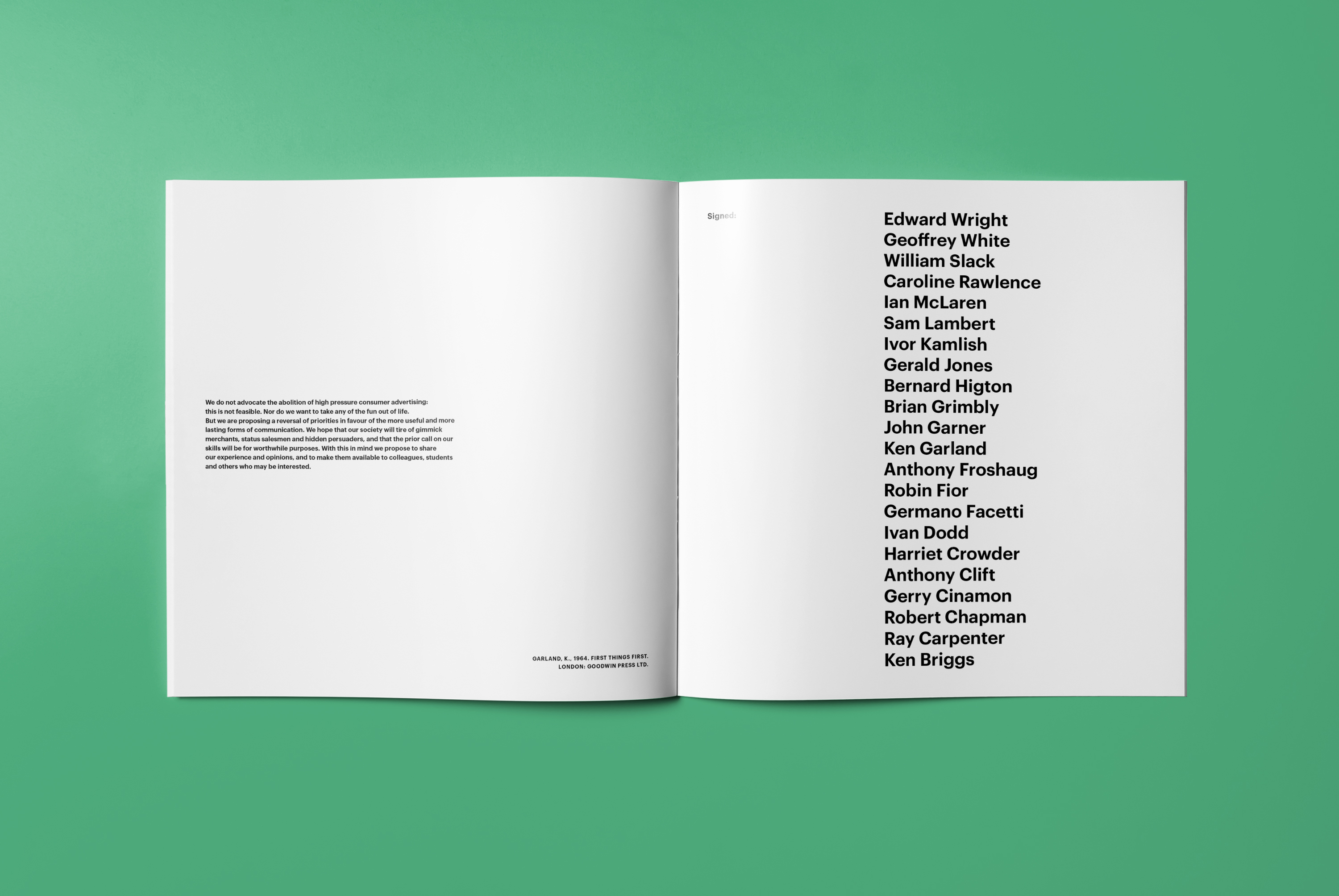
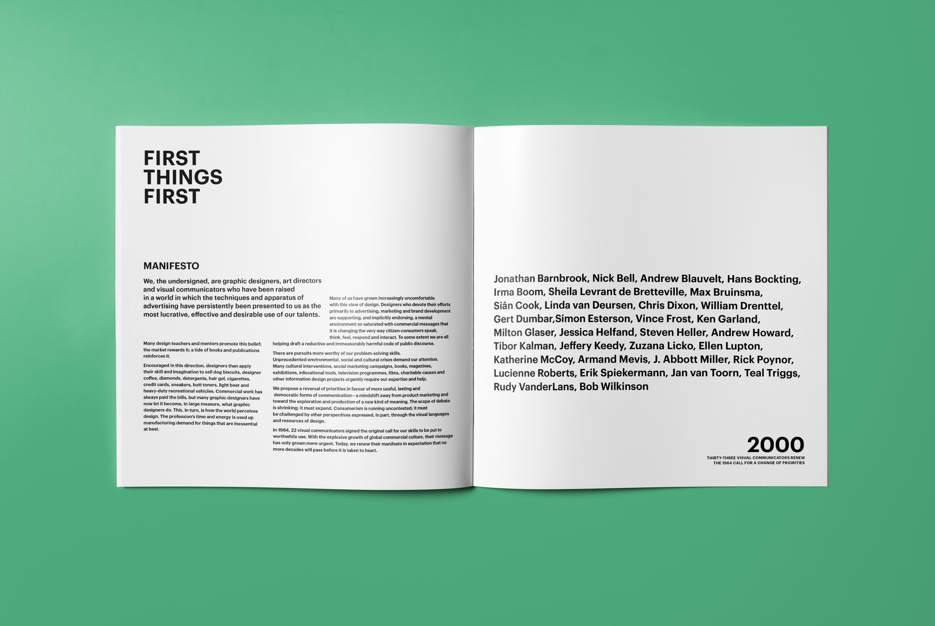
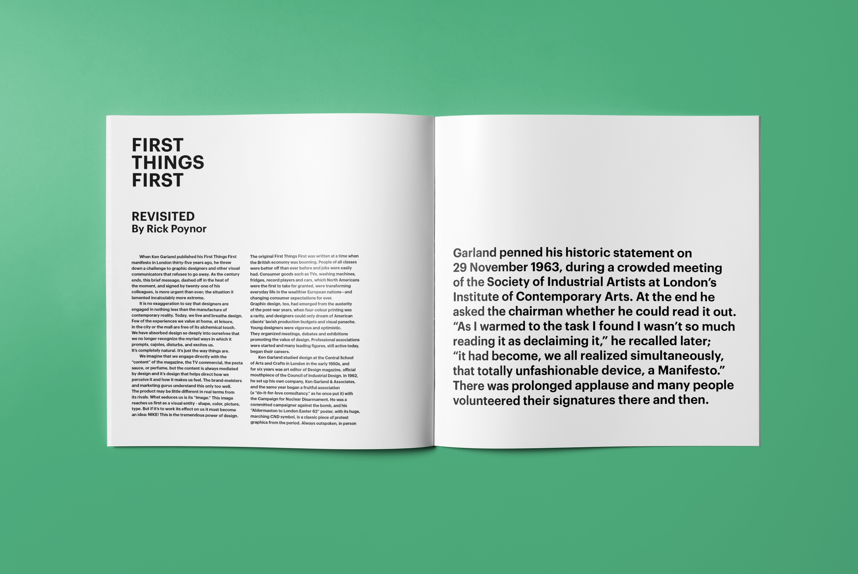
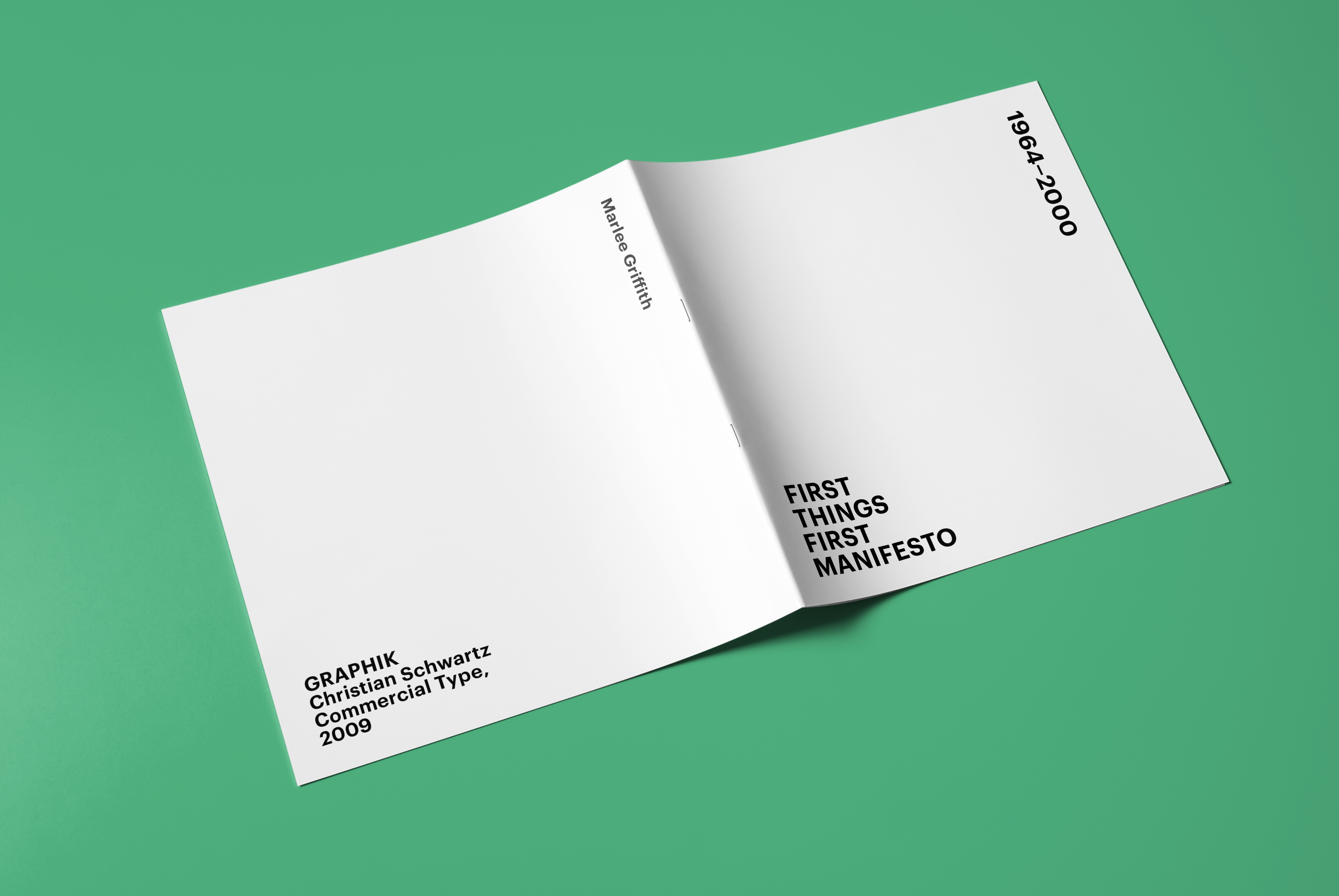
To draw attention to the importance of the text, as well as to bring interest to the square format, a bold typeface and dynamic were consistent throughout. To further bring the message to the reader, the typeface chosen, Graphik, is based on mid-century san-serif typefaces but designed in 2009, just as the manifesto was initially produced in the 1960s and then updated in the 2000s.

